Comparing countries. I made a couple of graphs, just out of curiousity, with a little help from NCES's Create A Graph.
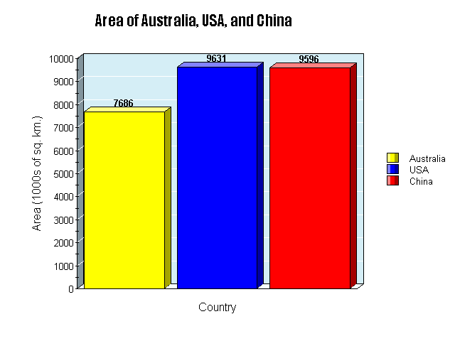
First, here's a comparison of Australia, the USA, and China, in terms of area. Pretty close, yes?
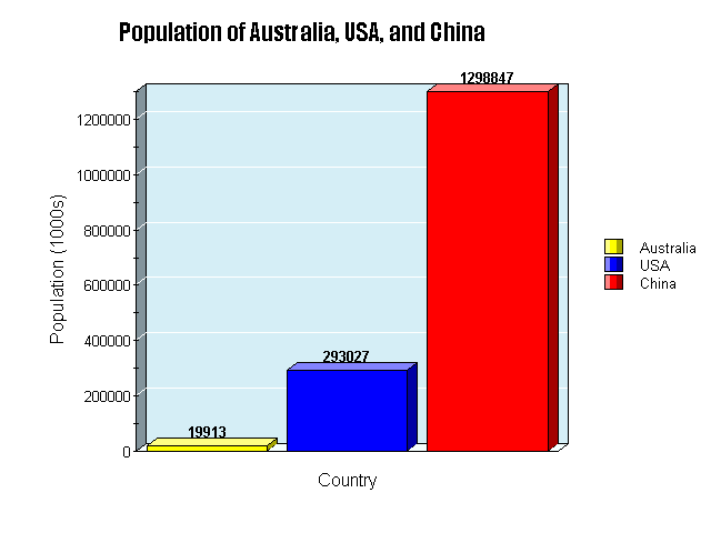
Now, see the graph comparing their population.
The point? I have none. I just think it's interesting.
No comments:
Post a Comment